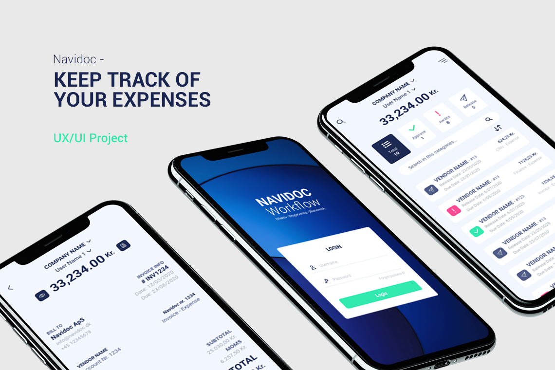
Navidoc is a software company that, with its groundbreaking cloud software, transforms its customers’ bookkeeping, making them paperless.
I worked with Navidoc to develop all their online materials such as the UI/UX of their backend software defining the desktop version as well as the iOs and Android app, and the new UI/UX of their website.
The goal was to make them easily understand their software for all kinds of users. Communication-wise, we strived to make every interaction with the platform more open and inviting.
👩 Role
Lead UI/UX Designer
- Help Managers to define features
- Conduct usability research
- Visual and interaction design
- Development collaboration
🤝 Stakeholders
- Managers
- Finance management team
- Development teams
- Internal invoice processing staff
🚀 Starting strong and quickly making progress
The project started with the development team already having initiated the creation of an invoicing experience divided into 4 major categories, like personal accounting software. Although it was an acceptable approach, the goal was to upgrade the old “Classic” experience with more advanced enterprise features.
To grasp how the current systems functioned, I observed some moderate to advanced users using the “Classic” experience to generate invoices. This showed that there was a lot of manual work involved, such as categorizing and adding details to items from another system (Microsoft 365), and the users were hindered by added steps and inadequate UI.
Given this, it was necessary to re-evaluate the design to focus on streamlining the workflow.
🪜 The first steps
It started with research, which consisted of:
- Reading documentation on current financial systems
- Technical discussions with developers
- Gathering information about the user base
- Discussions with users
📚 Initial process
From the research, I developed few hypotheses:
- The process can be made faster by incorporating data from other sources, including the supplier profile, payment system information and past invoice records.
- With these improvements, the number of necessary steps could be minimised consistently.
- Using a similar workflow as some other competitors’ financial systems, we could guide the user to a better understanding of the platform.
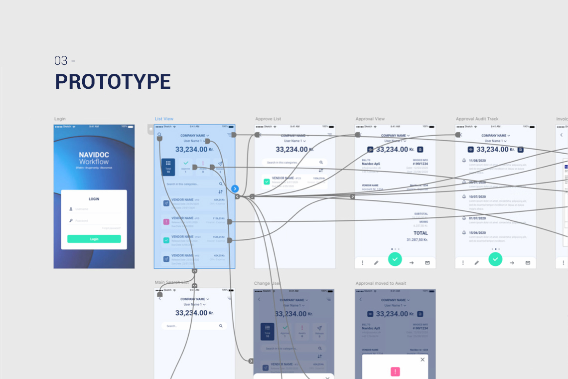
📝 Usability test
After optimizing the workflow, I had to verify my assumptions. To do so, I created a mock-up of the system using pre-made components in Adobe XD.
Then, I developed a research plan that included testing with internal users using a functioning prototype.
🎉 Project Outcome
Learnings
After a few rounds of user testing with the prototype, it was evident that some areas of the workflow presented challenges, such as displaying critical information in the interface and some confusion with icons.
After re-evaluating and resolving some pain points in the workflow, the final usability test was a success. This was followed by the creation of a high-fidelity prototype to be handed off to the development team.
Amazing Results
The average number of interactions needed to submit an invoice was reduced by a minimum of 65%.
User testing showed a significant reduction in the time required to submit an invoice.
USER FLOW


