Within the Macrolibrarsi website, we have decided to make some improvements to each department page. Starting from the “Food and Beverages” the focal point was to make navigating easier by displaying the list of subcategories ATF (Above The Fold) on the department home page.
In doing so, we expect customers to reach the category of their interest with one less click (instead of clicking on the menu or entering the keyword in the search field).
👩 Role
UI/UX Designer
- Conduct usability research
- Setup experiment
- Visual and interaction design
- Development collaboration
🤝Stakeholders
- Business owner
- Managers
- Department chief
📚 Starting from some data
- Only 6% of desktop users abandon the site from the Food home page vs. 14% of mobile users.
- Desktop visits to the “Food and Beverages” department are worth about 3 times more compared to mobile visits.
- Increase the page value.
- Reduce the exit rate from the page.
🪜 The first steps
Starting by setting up the experiment in Convert.com and analyzing the pre-setup data from Google Analytics in order to decide which categories were going to be shown ATF.
Estimate the experiment running time in about 20-30 days considering the great volume of traffic within the department.
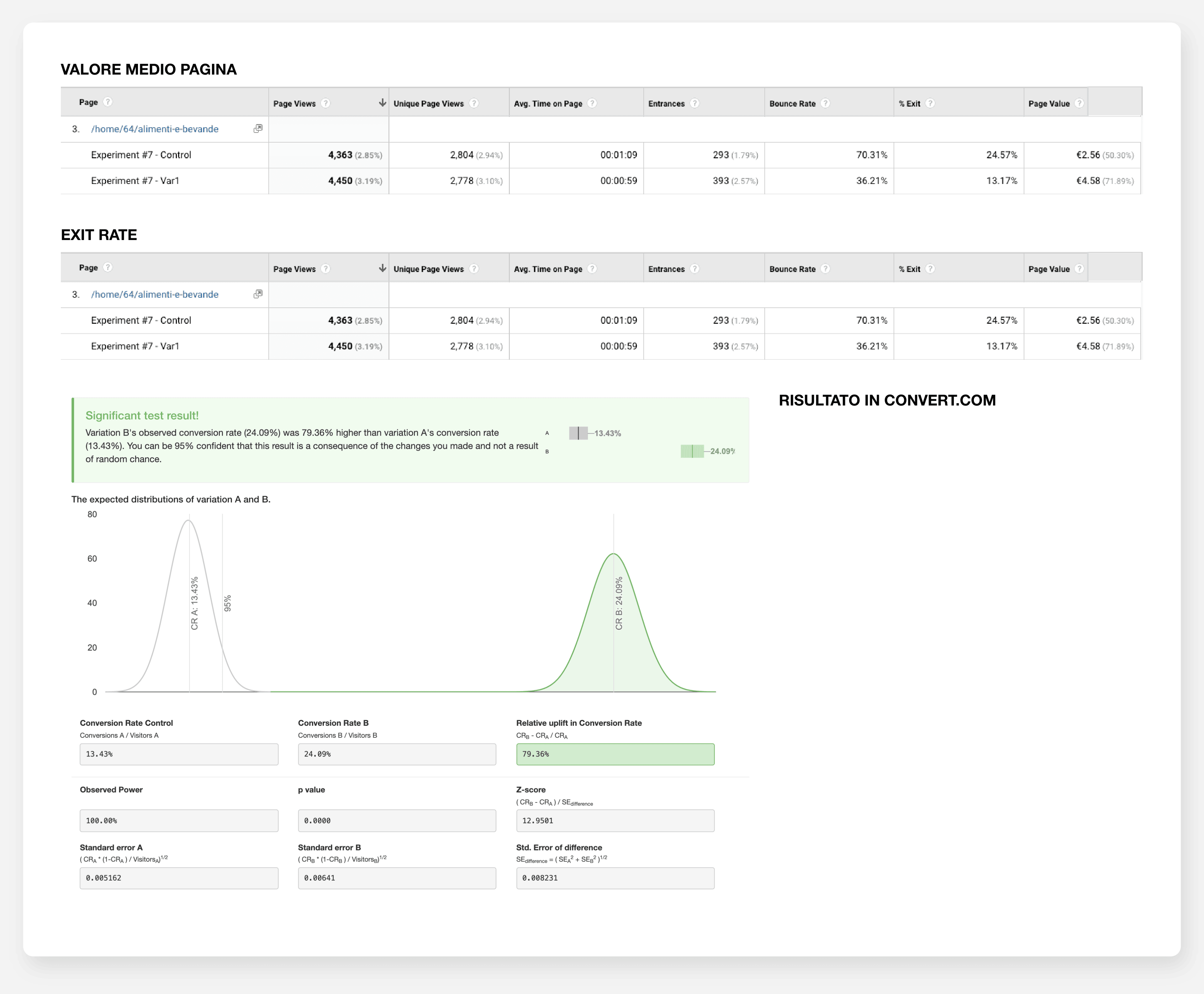
🚀 Testing results
- All Tested Users: 4417
- Experiment duration: 30 days
- Page Value department “Food and Beverage” +78%
- Exit rate (home “Food and Beverage”) reduced by 45% (Control 24% Vs. Variation 13%)
💡 Learnings
Facilitating access to subcategories positively affects engagement and average page value.
Further analysis shows the importance of exploring how the arrangement of graphical icons pointing to subcategories may influence their results.
🎉 Conclusion
It is recommended to carry out a detailed study on the arrangement of subcategories and then, implement the experiment and expand it to other departments’ homepages.