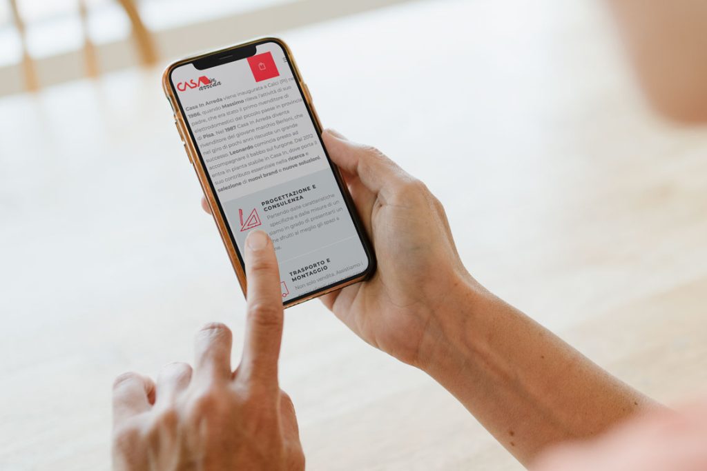
Casa In Arreda is primarily focused on household appliance retail and has a long-standing history of success in the industry. The company has evolved over the years and now offers its customers a wide range of solutions and brands, all while maintaining its core focus on household appliance retail.
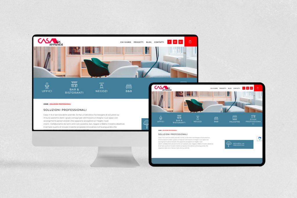
The goal of this project was to enhance the user experience and highlight the professional solutions offered. To achieve this, I focused on creating a clean and modern aesthetic that prioritized ease of navigation and a clear visual hierarchy.
Additionally, the layout showcases the professional solutions offered on the website, emphasizing the expertise and experience of the company in the field of home and office decor.
👩 Role
UI/UX Designer
- Help stakeholders to define features
- Define the features
- Visual and interaction design
- Development collaboration
🤝 Stakeholders
- Owners
- Development teams
- Internal staff
🎬 How it started
Using a problem solution tree we have identified the best way to approach this project.
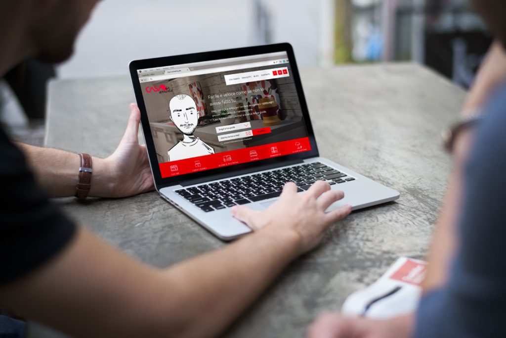
Problem: Convince users to use the form to get in touch with a professional and receive personalized assistance.
Solution: Highlight the contact form and include all relevant information prominently on the homepage.
Hypothesis: Include the contact form in the hero section. Use an eye-catching copy. Include images that grab the user’s attention.
🗝️ Key Insights
The project started with the development team already initiated the creation of an experience for showcasing household appliances and decor solutions divided into several major categories. Although this approach was acceptable, the goal was to upgrade the existing experience with more advanced features.
🪜 The first steps
It started with research, which consisted of:
- Technical discussions with the “Casa in Arreda” staff
- Gathering information about the user base
💡 Learnings
From the research, I developed few hypotheses:
- Center the website around user needs by adding a form on the homepage, encouraging users to fill it out and be contacted by the company in order to receive the best solution.
- Use a copy that leverages emotional appeals to encourage the user to contact an expert.
- Using a similar workflow as some other competitors’ websites, we could guide the user to accomplish the goal we want.
🎉 Conclusion
After a few rounds of user testing with the prototype, it was evident that the images needed to be improved, in order to be more friendly and eye-catching.
After re-evaluating and resolving some pain points, the final usability test was a success. This was followed by the creation of a high-fidelity prototype to be handed off to the development team.
The average number of interactions to fill out the form was improved by +25%.


